Safe place international
Redesign the sign-up process, simplify friend-adding, and improve the architecture of the settings of an organization that supports marginalized communities
About
Safe Place International (SPI) is a global organization dedicated to supporting marginalized communities, including LGBTQIA+ refugees and single mothers. By providing holistic development programming, SPI offers essential resources, advocacy, and support for individuals in crisis situations, such as violence, trafficking, or abuse.
impact
- Sign-Up Flow: Created a 13-screen flow, ensuring seamless handoff to development.
- Friend Page Redesign: Improved the “Add Friend” flow with a streamlined interface and note-adding pop-up.
- Settings & Notifications: Designed user-friendly screens to resolve pain points and support future updates.
- Design Audit: Led audits to align designs with user stories, providing actionable feedback for Phase 4.
- Delivered 14 screens to test the updated information architecture.
challenge
- Mobile-First Redesign: Focused on optimizing the Sign-Up, Add Friends, and Settings flows for mobile users.
- Overcrowded Interfaces: Addressed the complexity and clutter of existing pages by reorganizing content and introducing a more minimalist design approach.
- Information Architecture (IA): Restructured the IA to enhance clarity and accessibility, particularly for critical features like email updates and sensitive user settings.
Role
UX/UI Designer
Team
+ 4 UX/UI Designers
duration
3 months
The client expressed confusion regarding the need to review the actions taken in Phase 2 and how to implement those in Phase 3
I began reviewing phase 2 and conducting an audit design review of the previous design. For each screen I evaluated, I noted what aligned correctly (✅) with Material Design 3 and what the team needed to change (⚠️). I also provided recommendations (🚀) based on Material Design 3, research, and community insights for some of my cards.
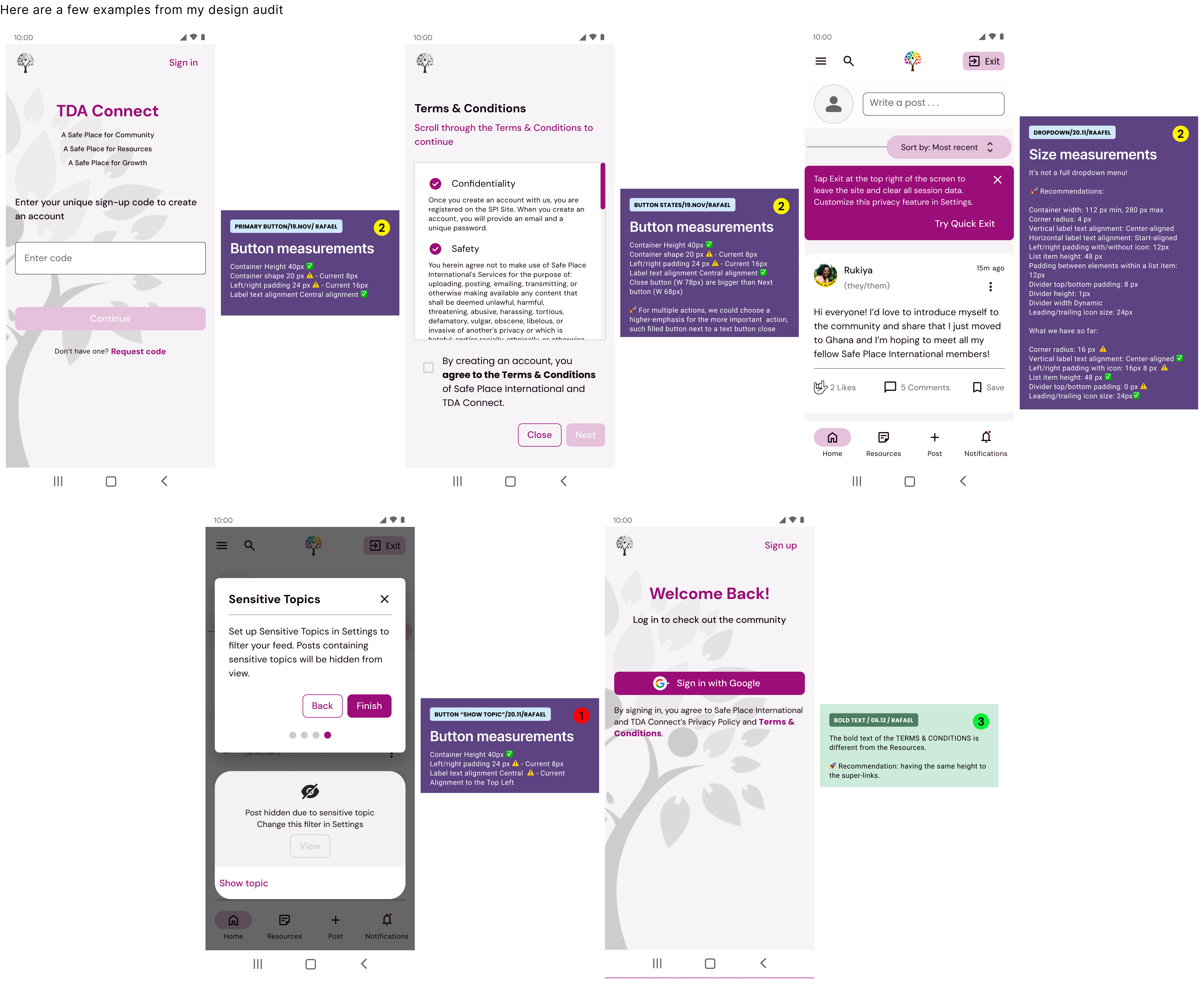
All the audits were based on Material Design 3 – Google’s open-source design system. It was essential for the team that built the SPI Design System.
Activities and outputs
Read report phase 2
Design audit
New brand guidelines were done - time to redesign
The client and the product leaders agreed on the new brand guidelines.
I started to review the documentation and determine how the new design style could be adapted for the sign-up, adding friends, settings, and notifications.

The new guideline was applied on the first sign-up page with my help and concern, and after that – I was responsible for using it for the whole flow.
From this point, I thought about maintaining the consistency of the brand and the desire of the client and product leaders.
Activities and outputs
New guidelines
Understand and describe the features of the new design
Redesign the new flow based on the guidelines and freely enhance the user experience
I prioritized working on the sign-up flow because it was one of the first handoffs to be delivered to the development team.
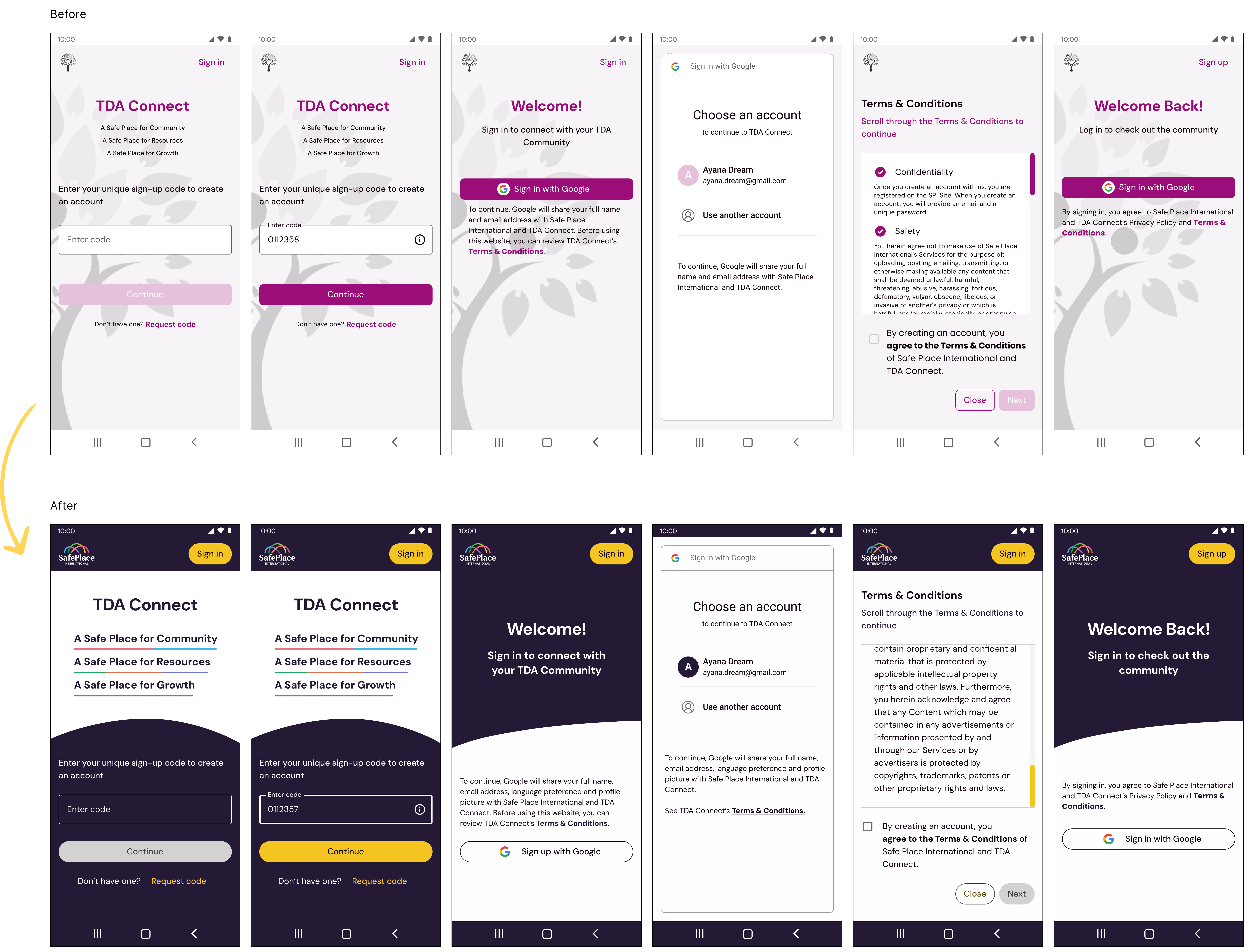
These screens are a few roughly representative examples of my designs. I also designed all the functionality and progression during this flow, including the enabling and disabling of buttons, error messages, checkboxes, and so on.
The sign-up flow approved by the client was pivotal for the other UX designers to redesign their flow.
Activities and outputs
Alignment with Product Lead and Client
High-Fidelity
I have gained confidence in the project and my design, and I am ready to take on additional tasks
After working on the sign-up flow and gaining a solid understanding of the team’s and client’s guidelines and expectations, I felt confident in my design decisions and ready to take on new challenges.
I also focused on enhancing the user experience within the flow during this process. I reevaluated specific steps to optimize usability, improved the UX writing to ensure clarity and alignment, and streamlined the information presented to the user for a more intuitive and seamless interaction.
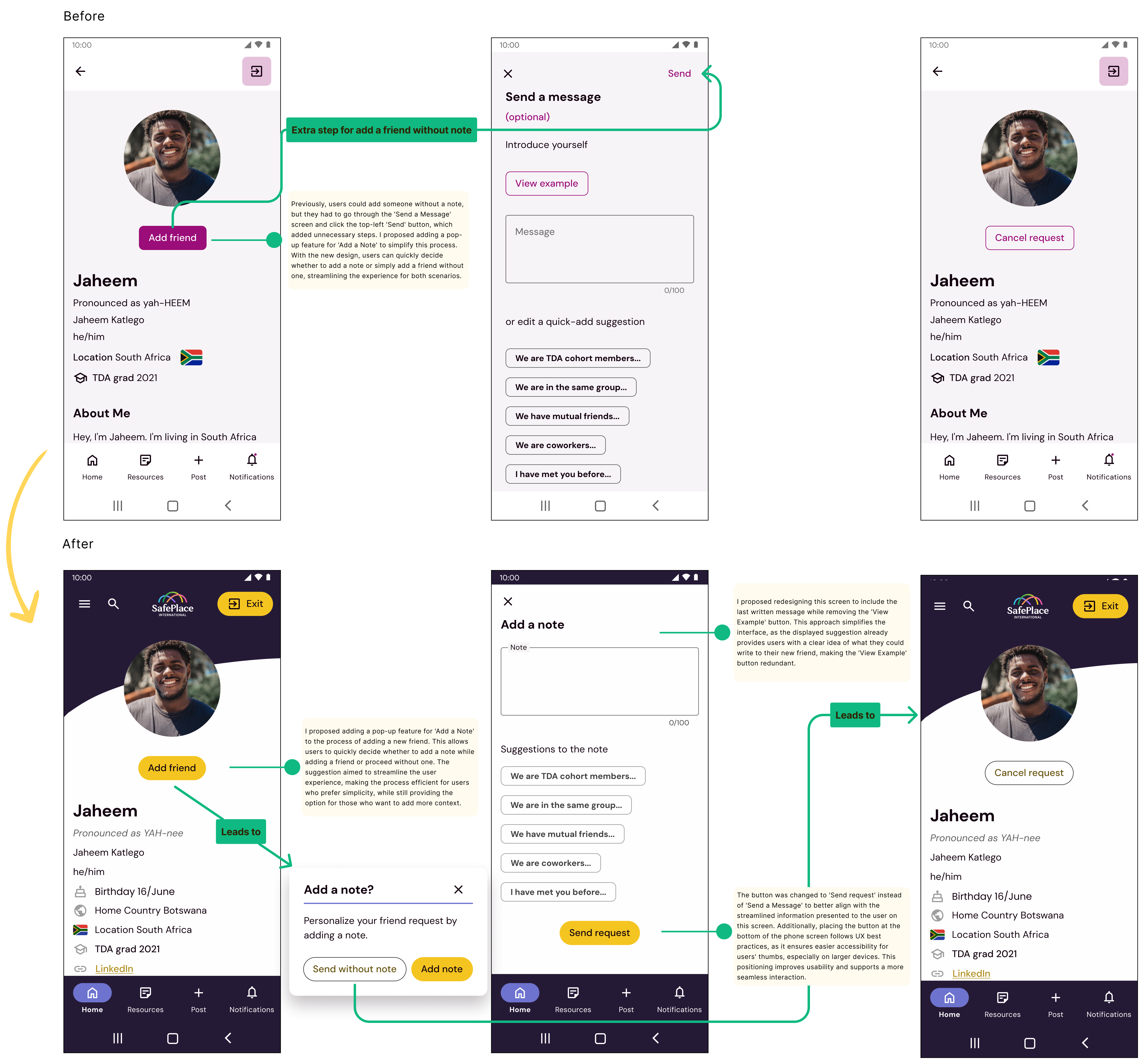
Adding new friend
Simplifying Complexity and Enhancing Usability
When redesigning the Settings flow, I looked closely at the information architecture and identified several areas for improvement. I noticed the layout was overcrowded, and some sections were confusing or difficult for users to navigate. These issues made it clear that a more intuitive structure was needed.
In this section, I’ve organized my decisions into three key areas: refining the information architecture, improving UX writing, and enhancing visual design. I explain the changes I made in each region and the reasoning behind them to create a clearer, more user-friendly experience.
refining the information

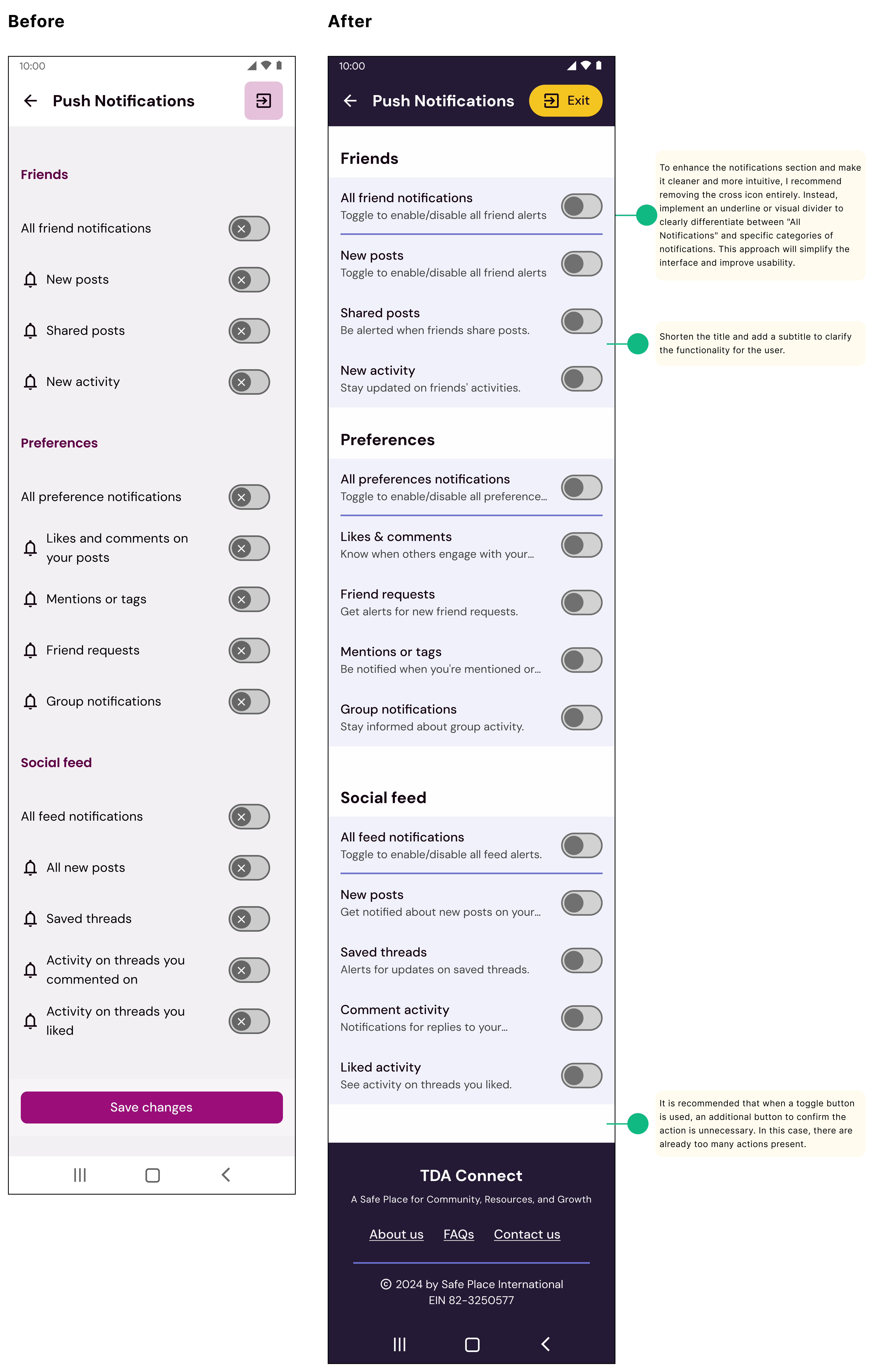
Notifications
I worked on updating various settings screens to align with the new brand guidelines. This involved revisiting the layout, typography, color schemes, and iconography to ensure consistency with the updated visual identity. I focused on creating a cohesive and user-friendly experience while adhering to the latest design principles outlined in the guidelines.
Activities and outputs
Information Architecture
Usability
UX writting
Key Design Decisions
Sign-Up Flow
I designed a seamless 13-screen flow that balanced clarity and efficiency. This was one of the first deliverables handed off to the development team.
Add Friend Flow
- Introduced a pop-up feature for “Add a Note,” offering users the flexibility to add a note or proceed without one.
- Simplified the interface by removing the “View Example” button, as the displayed suggestion provided sufficient guidance.
- Updated the primary action button text to “Send Request” for better alignment with user expectations and placed it at the bottom for optimal thumb accessibility.
Settings Improvements
- Created a dedicated screen for email updates, addressing issues with overcrowded content.
- Placed the “Log Out” button directly on the Settings screen for easier access, removing unnecessary navigation steps.
- Designed a clear, simple layout for sensitive topics to make this information easily discoverable without extra clicks.
Notifications Redesign
- Removed the cross icon for a cleaner interface and used visual dividers to distinguish categories.
- Simplified titles and added subtitles to enhance clarity and user understanding.
Unveiling Tomorrow: Recommendations for Phase 4
🚀 Refine UX Writing
Align content with user needs and expectations to improve communication.
🚀 Usability Testing:
Conduct usability tests and card-sorting activities to gain insights into user mental models, particularly in the settings flow, and refine the organization of content.
🚀 Minimalist Design
Simplify layouts by prioritizing essential information and decluttering interfaces.
🚀 Push Notifications
Analyze and prioritize the content displayed in the Push Notifications section to ensure relevance and usability.
key learnings
1️⃣ Iterating with Purpose: Through feedback loops and audits, I saw firsthand how iterative design can transform complex flows into seamless user experiences.
2️⃣ Usability Above All: I learned that even small tweaks—like repositioning a button or simplifying a label—can significantly enhance the user experience.
3️⃣ The Power of Consistency: Working on this project deepened my understanding of how a well-structured design system can drive clarity and efficiency. Leveraging principles from Google Material Design, I ensured uniformity across flows, which not only improved usability but also sped up collaboration with developers.
KPIs
1️⃣ User Engagement: Track the completion rate of the 13-screen sign-up flow to measure usability.
2️⃣ Friend Add Success Rate: Monitor how often users complete the “Add Friend” flow with or without adding a note.
3️⃣ Settings Interaction Rate: Evaluate how frequently users access and update key settings like email and privacy preferences.
Next up
storefront
E-COMMERMECE WEB PROGRESSION APP
Designing checkout flow for non-registered users in an e-commerce app
Streamlining the checkout process for non-registered users and building a simplified workflow for designers and develops.