storefront
Designing the checkout flow for an e-commerce app
About
Storefront is an online and in-store shopping center catering to users in search of convenient product purchasing options. It is an innovative PWA (Progressive Web App) platform designed to help how sellers create and manage their online presence.
impact
I designed the checkout flow, increasing the speed of the team, motivation, and communication with developing team.
challenge
Design a checkout flow for non-registered users, giving the project two faces—registered and non-registered flow.
Role
UX/UI Designer
Team
Product Manager,
+ 2 UX/UI Designers
Development Team
duration
5 Months
Storefront needs a UX Designer to design a non-registered user flow
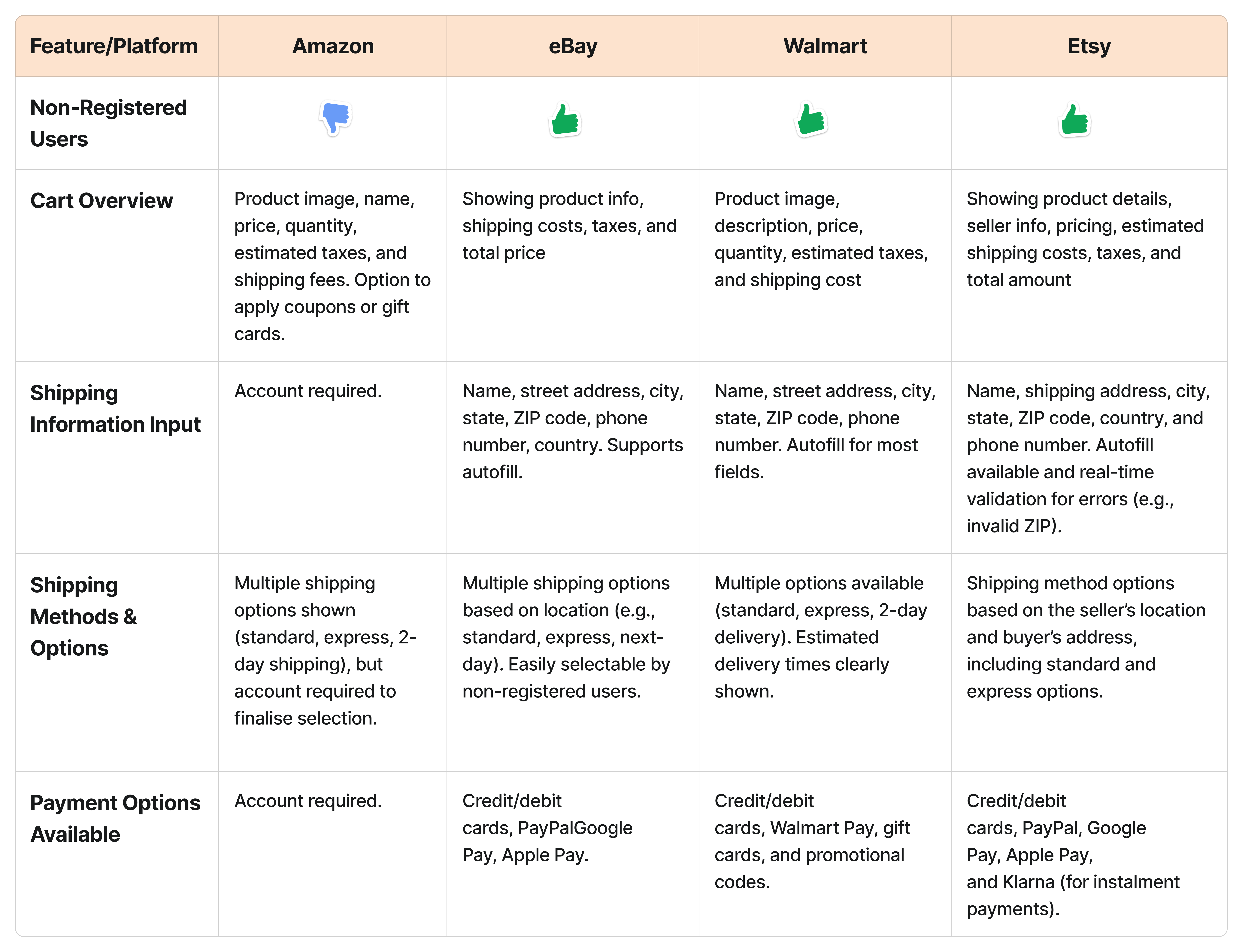
By looking at industry leaders like Amazon, eBay, Walmart, and Etsy, I focused on making the checkout process as smooth as possible. One key area is the cart overview, which ensures users can easily see product details, prices, and shipping costs.
Also, the focus is simplifying how users enter their shipping information—just the basics like name, address, city, state, ZIP code, phone number, and country.
Middle wireframes facilitate effective communication with the team and stakeholders
I created a middle-fidelity wireframe to share my ideas with the team, enabling us to discuss and evaluate if we met the project’s needs. These wireframes facilitated clear dialogue, early feedback, and informed decision-making before moving to high-fidelity design.
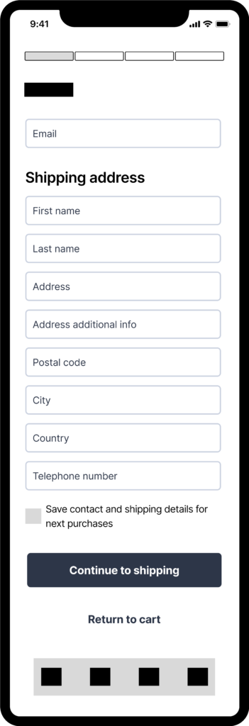
shipping information input
I separated the form labels into clear fields like First Name, Last Name, Address, Post Code, City, Country, and Phone Number to create a more organized, user-friendly experience.
🚀 Adding progress to keep users updated on current processes and offering estimates on how long a task will take.
🚀 Separating email as its distinct field allows for clear validation and ensures it doesn’t get lost among the other addresses and contact details.
🚀 Breaking fields down simplifies input, reduces errors, and helps users focus on specific information step-by-step.
🚀 Suggesting a checkbox to allow non-registered users to save their details and make it easier to fill out the purchase form.
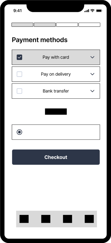
payment options available
I studied how leaders’ platforms handled checkouts and shared my findings with stakeholders to discuss payment options. Many platforms focus on credit/debit cards, PayPal, and digital wallets.
🚀 Through the research team, I learned that Storefront’s users prefer Pay on Delivery and Bank Transfer.
🚀 Suggesting to add a drop-down box to the wireframe design. The idea is to prevent the user from feeling overwhelmed and to make it easy for them to select their payment method by clicking the drop-down box.
🚀 Design clear checkboxes and color changes to make it easier for users to select their payment method.
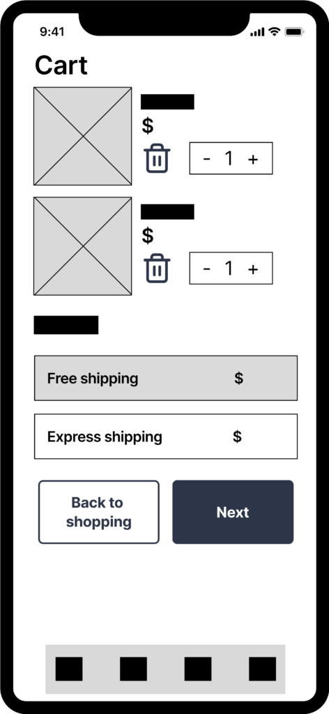
cart overview
I analyzed how the competitors are performing in the market. The wireframe includes the image, quantity, a short description of the item, and the option to remove it from the cart.
🚀 Design a suitable size for the item image and provide a summary of the shopping value.
🚀 In the same screen, the user can choose the shipping method and view a quick visual representation of the cost.
🚀 Button “Next” is a primary call-to-action button that prompts the user to proceed with the purchase.
Beyond! Refining wireframes for optimal functionality and adding more features
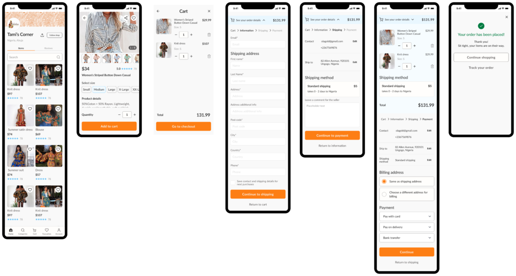
After presenting the mid-fidelity designs to the team, I gathered valuable feedback that informed my next steps. My next step was to create high-fidelity wireframes, incorporating the suggestions and improvements discussed in our meetings. Throughout this process, I followed the established design system and suggested new components to implement in the design.

Shipping address input
The structure was maintained from the mid-fidelity. I can tell that significant alterations were added to the cart drop and the details of the progress bar. The stakeholders wanted the name, and the “information” name was adopted to this screen.
🚀 Suggest keeping the cart details summary by the drop-down to remind the user about the price and the possibility of adding or detailing products from their cart overview.
🚀 Designing a component for text input, I followed best practices to allow a user to receive clear visual feedback. These states provide clear visual feedback, guiding users through the form efficiently. Overall, this approach enhances usability by minimizing confusion and encouraging successful form completion.

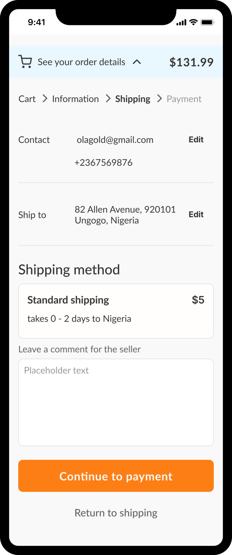
Shipping summary
This page was designed using high-fidelity wireframes to give users a quick summary of their main details. Choose from the previous page, as well as the comment for the seller.
🚀 The progress bar shows the user’s current position and allows for easy navigation.
🚀 Edit button to give the users the possibility to adjust their data.
🚀 Learned from the research that users from the storefront would like to have the possibility to leave a comment for the seller. Some users may resell items and prefer not to have them packed together.
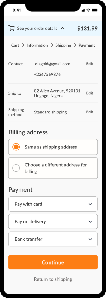
cart overview
The payment page serves as the culmination of the non-registered user checkout process, providing additional details and options for users. Notable enhancements include the ability to swiftly modify user information, update the billing address, and manage access to different payment options.
🚀 The component for the payment option is a dropdown menu that allows users to select from a collection of choices. This avoids the overwhelm of information, as the user needs to fill in different information based on the choice made.
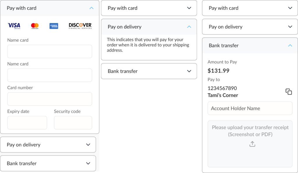
cart overview
The cart overview maintained the strutted from the middle-fidelity wireframes. My design decision was to create different cart overviews that communicate to the user the cart when the user is browsing in the store and adding items to the cart, and then another for the items already chosen and the user having them as a cart overview drop-down display during checkout flow.
🚀 Call the action button for the checkout with the items selected.
🚀 Overview about what it was selected and the shipping method choice.

Where I landed
Users can quickly review their selected items and adjust quantities directly from the cart, eliminating backtracking. The checkout flow allows non-registered users to input shipping information without extra steps, presented in manageable, clearly labeled screens that guide them smoothly. Shipping and payment options are flexible, offering choices like credit card, bank transfer, and cash on delivery. Once the purchase is complete, a clear confirmation screen provides tracking options, giving users confidence that their order is successfully placed.
Key learnings
1️⃣ I contributed to ensuring that our team design principles were consistently applied. I championed the use of our established guidelines, which emphasise.
2️⃣ I focused on optimizing the checkout flow for conversions, acknowledging that many potential customers might hesitate at the point of purchase. This involved creating a seamless experience for non-registered users.
3️⃣ My collaborative approach to design and positive attitude ensured effective communication with the team. I proactively proposed ideas to solve design challenges and add value to the business strategy.
Next up
EASY HIRE
JOB’S PLATFORM
Empowering International Students in Norway by overcoming job market barriers through communities, feedback, and language skills
Enhancing job opportunities for international students in Norway and adhering to more possibilities for receiving feedback, tracking, and networking.

